Here is a small selection of the work that I did for my previous employer – illustrations, graphic design and marketing materials produced by me.


Here is a small selection of the work that I did for my previous employer – illustrations, graphic design and marketing materials produced by me.
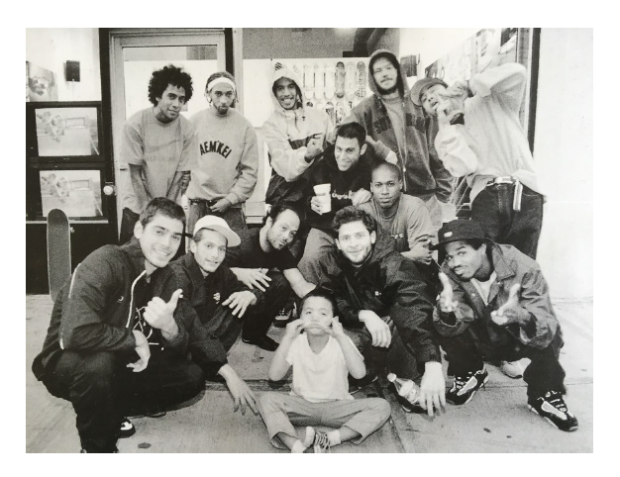
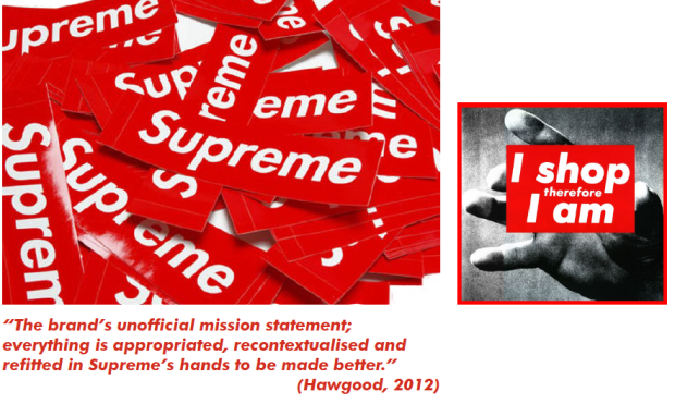
In the past 20 years, it has become apparent that consumers are now desensitised to the traditional methods of ‘who can shout the loudest’ marketing, instead requiring brands to reach out and “give back” (Smilansky, 2009) in some way to the customer.Director and founder of experiential marketing agency Blazinstar Marketing, Shaz Smilansky implores her readers to embrace a new form of marketing which “builds a real relationship” with consumers and “adds value to target audiences in their own environments”(2009). This case study focusses on a brand who has fostered a highly curated mix of both experiential marketing and public relations which has in turn created a unique brand personality. Supreme first opened in the Spring of 1994 and soon became established as the home of New York skate culture; since this point, through numerous celebrity/artist collaborations and guerrilla marketing techniques the brand is now acknowledged as the definitive “aesthetic of an era of rebellious cool” (Rubinstein et al.).
Cultural x Emotional Branding
Douglas Holt, leading expert on branding and innovation supposes in his book ‘How Brands Become Icons: The Principles of Cultural Branding’ (2004), that there are four main branding models and companies follow: cultural, mindshare, emotional and viral. He argues that to become an iconic brand, a company must fall into the ‘cultural’ strand of marketing. However, it could be supposed that Supreme’s branding strategy is actually a unique synthesis of both cultural and emotional which is what gives the brand it’s competitive edge. In this, we see Supreme as the needle in the haystack, it presents the “myth” (Holt, 2004) of a brand delivering ‘supreme’ quality goods, high-profile artist collaborations and quite frankly, a very unusual sales style in conjunction with it’s secondary function as a social hub where people would “just hang out” with no pressure to actually buy anything. By doing this, Supreme managed to both portray the image of being the “author” of an authentic product and a “friend” to the customer. One important element to highlight is that Supreme as a company has “never sought mainstream relevance” (Welty, 2012), but instead always strived to be authentic and provide good value. This is where the brand draws on emotional branding strategies; as described by Holt, key words associated with this form of branding are: Brand personality, experiential branding, brand religion, experience economy. How does Supreme tap into this strategy?
Cultural x Emotional Branding 1. Brand Personality
Brand Personality, as described by Aaron Bondaroff, former employee at Supreme and “counter-culture muse”:
“race wasn’t an issue, money wasn’t an issue, we were all one colour and that colour was character”
“we really created a fucked-up shopping experience”
“a lot of attitude”
“if a customer touched the display the staff barked at them, fuck you”
“pretty heavy for an outsider”
The personality that Supreme puts forward is reminiscent of that one unapologetically blunt friend, they say it how it is, they are unpretentious and “don’t waste fabric or words or attitude” (O’Brien, 2010).

Cultural x Emotional Branding 2. Experiential Branding
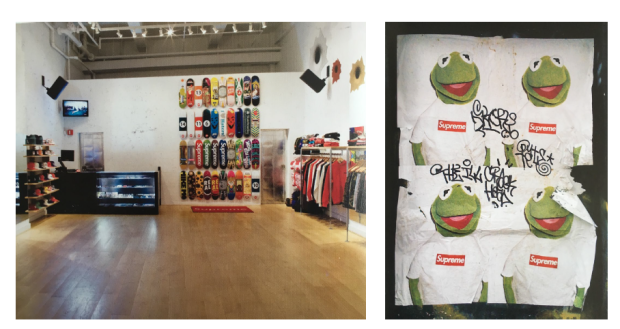
Walking into supreme’s heavily curated stores has been likened to walking into a gallery, as is the fact that before a new collection drops, the store will be closed for installation, and will reopen with new items. Similarly, customers are encouraged to look but not touch merchandise unless they fully intend on buying.
In the introduction of ‘Supreme: Downtown New York Skate Culture’, American writer and editor Glenn O’Brien reflects “eventually I learned that there was something analogous to art sales going on here; the cats in the queue were there to get limited-edition merchandise. But I couldn’t recall anyone ever camping out for the release of a lithograph” (2010). Furthermore, Supreme has a long history of using celebrity endorsements and sponsorship as an experiential branding technique; unlikely muses such as Mike Tyson, Lou Reed and Kermit the Frog all contribute to the underground, gritty image that the brand puts forward. Rather than paying extortionate fees to advertise, Supreme’s campaigns are often very lowbudget, frequently employing illegal tactics such as flyposting or hijacking and appropriating other companies posters with their stickers. The posters have become so iconic to the brand image that in London in 2015, the day after their poster campaign had launched, not one poster could be seen around the city as ‘fans’ of the brand had taken down every single poster to keep as a collectable.
Cultural x Emotional Branding 3. Brand Religion
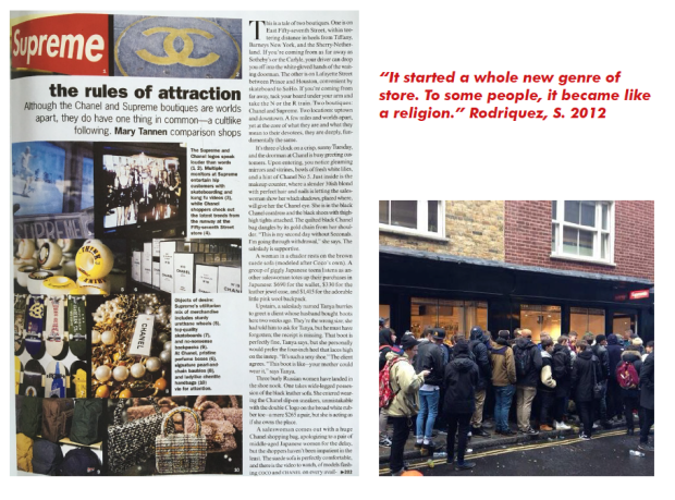
In this phrase coined by Holt (2004), brand religion describes the process whereby an organisation is able to cultivate a brand spirit which is expressed “in everything that they do”, and that both employees and customers start to “treat the brand as a religion”. To a certain extent one could consider Supreme to possess “at least some qualities of a cult” (O’Brien, 2010). Take the queues that form outside their stores every time a new line is released, a sight that has been witnessed on multiple occasions, they have customers camping outside the store whatever the weather. Founder of the company, James Jebbia said of the phenomenon “they’ll see the lines at the store and say: ‘Those kids are crazy. What are you guys selling, crack?’” (2012) but he argues that “there’s no tricks or gimmicks. It’s all about good product”. Holt suggests that although peculiar, this devotion is not uncommon if a brand is “communicated with supercharged emotion” (2004). It is also argued that Supreme manages to draw in these crowds due to the short runs of each of their products – they have receive criticism that they purposefully create this uneven supply and demand chain to appear more exclusive, however Jebbia claims “the main reason behind the short runs is that we don’t want to get stuck with stuff that nobody wants” (2010)
Guerrilla Marketing Strategies
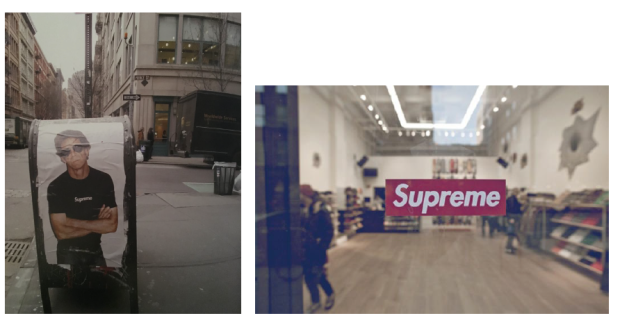
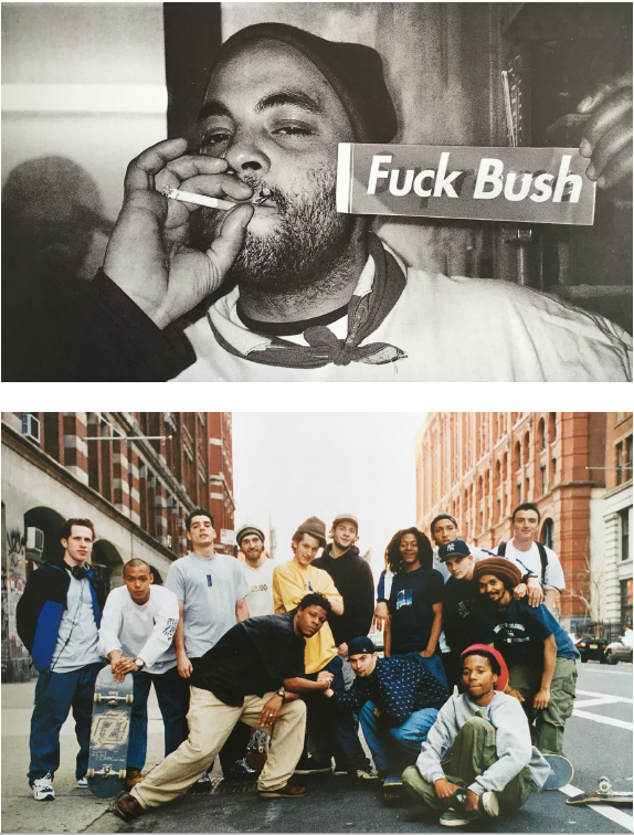
Well known for their thrifty advertising techniques, Supreme have, over the past two decades, managed to assert themselves as “the holy grail of high youth street culture” (Hawgood, 2012) through subversive and underground methods of marketing. In the early days, in an era of “no internet…no money for advertising… no magazines to advertise in”, the brand made the decision to use the lowbudget option of stickers at a way of “getting [their] name across”. Although it may not seem like an obvious way to market themselves, as New York-based artist and designer KAWS points out in an interview with Jebbia, “stickers were the most common sort of communication tool for skaters”(2010) at the time and therefore made perfect business sense as it was speaking directly to their target audience. With their bold look, the stickers became somewhat of a trademark for Supreme and can now be found plastered in obscure nooks and crannies in almost every city. Stickers could also be considered a basic form of experiential marketing, as it allows “the consumer to live, breathe and feel the brand through interactive sensory connections and activities” (Smilansky, 2009). Experiential marketing is especially useful for a small scale business like Supreme because it promotes word-of-mouth better than any other type of branding. According to Shaz Smilansky, consumers often “aspire to lifestyles that their favourite brands portray”, which leads them to wanting to “immerse themselves in the brands they love”(2009) and therefore they start to do the marketing for the brand through word-of-mouth.
The Logo
In addition, one cannot talk about the visual identity of Supreme or it’s many artist collaborations without addressing the elephant in the room: the logo. The brand has a reputation for appropriating various graphics and hijacking adverts, but nothing is quite as obvious as their Barbara Kruger-esque logo. It’s there, the same Futura Bold Oblique, the same white on red. Owner Jebbia doesn’t see the duplication as an issue however, he just saw that it was perfect for his store and a compliment to Kruger, “I gave him [his friend] a Barbara Kruger book I had and asked him to place ‘Supreme’ over the images in a similar style…the actual Supreme graphic that he had done just looked really bold and simple, kind of like the store itself” (2009).
In terms of semiotics, one could suggest that by appropriating the appearance of Kruger’s work, supreme is inextricably linking itself and embedding itself within the art world. A link which is reinforced further by their numerous collaborations with infamous artists such as Jeff Coons and Damien Hirst.
Artist Collaboration: PR
Here are just a few examples of the many collaborations that Supreme has engaged in since opening in 1994. In her book on experiential marketing, Smilansky explores the notion of sponsorship and it’s impact on brand image, she asserts that “sponsorship aligns the brand directly with people’s current perceptions of the company” therefore a brand must be totally invested in the visions of the artists and celebrities that they choose to associate themselves with. As Glenn O’Brien points out, Supreme are by no means the “first commercial venture to enlist artists to create merchandise, but it is the first to offer the artists’ merchandise at a regular price”(2010). By pricing these limited edition decks at the same price as all of their other boards, Supreme are essentially making a creative statement- they “refuse to sell out” (O’Brien, 2010) and they aim to democratise the otherwise elite art world. Furthermore, O’Brien makes an astute observation in that “Supreme is redeeming art from it’s own worst tendencies by making it available to the people who would probably appreciate these artists more profoundly than their typical collectors do”. In a cruel twist of fate, one gallery took it upon themselves to collect these limited boards and display them in glass cases, defeating the purpose of the projects entirely.
“What makes Supreme different from any other skateboard brands is how [they] brought contemporary art over to skate culture” Fujiwara, H. 2014

Conclusion
What can we take from this case study? Supreme is a great example of how clever targeted marketing can be super effective; by using it’s own fan base do the majority of it’s marketing through stickers and more recently, social media, they continue to grow a dedicated army of likeminded followers. They don’t necessarily appeal to the mass market, but that has never been their intention; they are very content with delivering consistently good quality designs to their niche circle. Perhaps this is the most important thing to take away from Supreme’s example – pick something that you are good at, build up a great reputation through effective/relevant collaborations and good PR, and stay true to your design aesthetic. Be authentic and “refuse to sell out”. Their nonchalent attitude towards business and their refusal to ‘go mass-market’ are not the tradtional paths that lead to a ‘successful brand’, yet somehow Supreme has done it. They prove that you don’t have to go to business or marketing school in order to create a successful, authentic brand- you just need a gut feeling and the nerve to say ‘fuck you’ to the mainstream.

Last week, we got the opportunity to visit the Whitechapel Gallery who are currently staging an eclectic exhibition called ‘Electronic Superhighway’. This exhibition aims to document and highlight the impact of computer and Internet technologies on artists from the mid-1960s to the present day. Below is a collection of images I took from the visit:


What soon became apparent to me was the overwhelming number of screens and digital artwork, which in turn raises the question: are we too digital? One of the pieces that particularly stood out for me was a video by Ryan Trecartin called “A Family Finds Entertainment” which was a bizarre video montage which aimed to “reflect on cultural references of a generation that has been affected by the consumption of mass-media”. In this film he explores the ideas of costume, gender fluidity and queerness in a way that is somewhat uncomfortably ‘trippy’ to the viewer. I overheard one of the gallery invigilators explaining to a visitor that this piece has a somewhat ‘marmite effect’ on viewers – some people get it and love it, and others leave feeling confused and hate it.
Throughout the exhibition, central themes appeared to revolve around gender and queerness; whether this was deliberate or accidental, I do not know. Perhaps it could be connected to the fact that the past 50 years have really been the most liberal in terms of what is accepted as cultural normality. It is interesting to see how advanced some of the ideas portrayed in the exhibition were for their time, which plays into an idea that we have been discussing in class – future forecasting.
We were asked to pay attention to how the exhibition had been curated and to make note of the way finding techniques employed within the space. The pieces seemed to have been curated non-chronologically and seemed to lack any specific themed zones; I would be interested to find out from the curator why they chose to do this, and what effect they had tried to achieve.
Overall, I would say that this exhibition is well worth a visit – with such variety and interactivity I’d say that there is something for everyone here.
On Tuesday, we were given the opportunity to visit Common House in Bethnal Green. CH was founded in 2013 as a reaction to the lack of free and available working space for activist and community groups. The emergence of these types of spaces is not a recent phenomenon however; the social centre, convergence spaces and protest camps are all examples of this sort of communal working space.
One of the key ideas endorsed by Common House is that the shared resources are not just used and consumed by members but also contributed to – give and take system.
One thing that I really liked about common house is that the space and community that use the space actively encourage involvement from new members, rather than just allowing people to passively enter the space. The walls are covered in all sorts of activist paraphernalia: Riso prints, placards and leaflets. Which to me is a reflection of their belief that many activists are actually artists without the necessary resources/skills to produce material – they prove that by pooling resources, some amazing pieces of work can be produced. Because of this, the concept of authorship/ownership becomes redundant; as long as good designs are produced, it doesn’t matter who made it. In order to encourage new members to join the Common House cause, a Riso Print Club was created. This club aims to get together regularly and think about the print process, creating a culture around creative practise.
What is hacktivism?
A term first used by the online collective ‘Cult of the Dead Cow’, hacktivism now refers loosely to the act of using the internet to incite some sort of change (whether that be the democratisation of software, or exposing hidden truths). It is interesting to note that although hacktivists and their actions are generally portrayed in a negative light, they actually use a number of traditional forms of protest (sit-ins, petitions etc) in order to make their point.
Clicktivism …refers to the semi-passive act of putting your name towards a cause without fully engaging or investing in the project. A good example of this is the site “Change.org” which allows anyone to create a petition and post it online to gather “signatures”. The intentions of this website are very obviously positive and righteous, and the very nature of the internet means that previously local problems become accessible worldwide. However, with this new platform comes an influx of new problems and causes that you may or may not care about, and this indifference means that the act of signing these petitions no longer feels powerful and exciting (which in turn decreases the amount of people signing for these worthwhile movements). Take my current email inbox, for example:
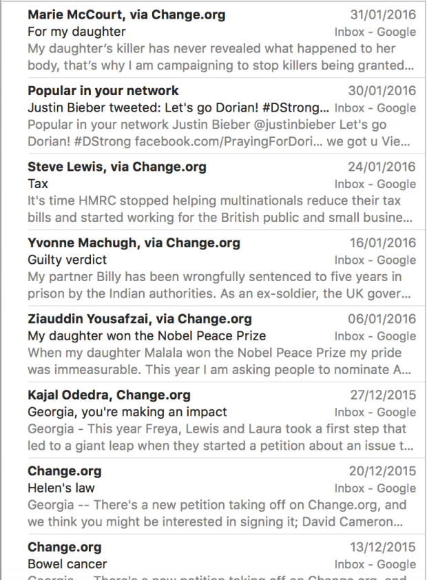
I have received 7 emails from Change.org in the past month alone. It makes it extremely difficult to find a cause that you can actually believe in and back 100% when you are inundated with so many different options.
Despite this, there have been a number of high profile cases lately, where these public forums have created such a big impression that the issues in question have been brought forward to be discussed on a government level. Most notably for example, was the petition signed by over 500,000 British citizens calling for Donald Trump to be banned from entering the UK. What started off as a joke became a national issue which was formally debated in parliament; truly showcasing the power of the people (for want of a better phrase).

Recently we got the opportunity to visit an exhibition of prolific war activist and unofficial documenter Peter Kennard’s, most influential designs, staged at the Imperial War museum in Lambeth, South London. The work on show was a mixture of anarchic war protests and more traditional fine-art depictions of the atrocities of war.
One aspect of the exhibition that I really enjoyed, was that it allowed the viewer to see both the anti-war collages in their raw state as well as in the context of the newspaper and magazine covers for which they were intended. At first, I found the concept of this anti-war art being shown and celebrated in a museum which essentially glorifies some aspects of war, to be somewhat absurd, but on reflection I realise that this is the perfect place to display this type of work. My reason for saying this is that I feel like this exhibition allows the museum to attract a new audience of young, politically aware and engaged individuals that perhaps would not normally be inclined to visit the IWM.

What did the exhibition try to do?
This exhibition aims to evoke strong feelings about war, conflict and the ongoing financial powers controlling military action. It attempts to enlighten visitors to the museum of some facts that may have previously been concealed from the public, such as supplying the business cards of various arms companies involved with the Iraq and Syrian wars.
How is it effective?
The shock factor definitely plays an important role in ensuring that this exhibition is effective – without it, no feeling or emotions are stirred, rendering the art ineffectual.
What strategies does he use?
By taking his work out of its ‘natural’ or intended environment and situating it in a gallery space, the work has somewhat more of an impact because it does not have to compete with other ambient pieces. For example, a typical piece of design activism could be located on a street or on a front cover of a magazine, and therefore to be see, the designs have to be more crude and shout louder than the rest in order to be seen. Therefore, when taken out of context, these pieces are so forceful and arresting.

What mediums does he use?
Kennard uses a range of different mediums:
Like many activists, Kennard tends to use materials that are readily available and cheap to acquire, but in my opinion his most effective pieces are the subversive collages that he creates. By combining images from popular culture with highly graphic war articles (bullets, gasmasks etc.), he established his work within our current reality and therefore brings it to the forefront of our consciousness.

But without repetition, how does a brand create consistency? And without consistency, how does a brand maintain value?
In his 2011 article for the design agency Method, of which he held the position of Principle/Global head of branding, Marc Shillum explores the notion of using ‘patterns’ as a way of branding in contrast to the more conventional method of repetition. In this theory, he is introducing a style of branding which is far more intuitive and adaptable than the traditional idea of using “consistency” as a strategy. His essay caused waves in the industry, being picked up by multiple advertising and branding publications, including PSFK, who described the use of patterns as “the ability to continually reinvent the brand image according to what is most relevant at the time”(Woloszczuk, 2014)
In his article, Shillum describes the 5 key elements that make up his argument:
01. Patterns are both adaptive and coherent
This is the idea that a company is able to tap into the human psyche, and understand that consistency is one of the key elements that contributes to brand value and encourages brand loyalty. However, Shillum explains that this consistency does not necessarily have to come from repetition (as widely believed), but can also be derived from the “formation and recognition of coherent pattens” (2011). These patterns can be a number of things, from behaviour, thoughts, actions and memory, and can “create consistency around differences and variation” (Shillum, 2011).
This idea is expressed most succinctly in the following sentence:
“To succeed in a more agile world, a brand needs to think less about defining a fixed identity and more about creating coherent and flexible patterns” (Shillum, 2011)
02. Patterns can be both a big idea and multiple small ideas at once
Think of this as a big-hit tv show, which gains a huge number of fans in a small space of time; in order to capitalise on this success, a ‘spin-off’ show is created which appeals to both existing fans and brings in even more viewers.
Or even, a fashion house brings out multiple collections for a single season: resort wear, sportswear, leisurewear and couture. Each of these collections is different yet has a consistent mark/vibe of the designer.
“Patterns can communicate different messages in parts and a comprehensive message as a whole.” (Shillum, 2011)


03. Patterns are the way people remember and recognise new value
“Repetition of patterns build recognition, but variation in patterns creates relevance and sustains interest.” (Shillum, 2011)
Patterns can be utilised in order to create infinite variations whilst keeping a strand of continuity. Take into consideration the English language, composed of only 26 letters yet, as of January 2014, there are currently 1,025,109 words officially recorded. From these words, an almost infinite amount of sentences can be constructed, create interesting linguist patterns, yet there is still a degree of consistency because there is only a limited number of letters. If you suddenly introduce a word in French, this would disrupt the discourse and become difficult to understand. TBC
04. Patterns are both foundational and transferable
“Self-similarity makes patterns easy to follow, and when applied as an organizational system, the power of a pattern can be exponential. Because self-similarity is a more complex form of repetition, it creates the same consistency and brand value, yet it is distributed and not centralized.”
05. Patterns create belief and trust
“Trust is built upon this understanding of the meaning of a recognized pattern. Recognition of a pattern becomes associated with a desired outcome, conditioning people to respond to the pattern with belief.”
Woloszczuk, N. (2014). Marc Shillum, Method Design: Consistent Brands Through Repeating Patterns – PSFK. [online] PSFK. Available at: http://www.psfk.com/video/marc-shillum-consistent-brands-repeating-patterns [Accessed 27 Jan. 2016].
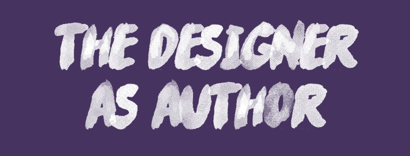
In this session, we were looking at the concept of Authorship within the context of graphic design. It strikes me as an unfair challenge that the graphic designer will always have to face; if he/she must adhere to a particular brief/work under a larger studio, how may they claim total authorship over the work? We did a discourse analysis exercise of a text by Michael Rock for Eye Magazine in 1996 called “The Designer as Author”, which highlighted some key figures in this area of research such as Roland Barthes and Michael Foucault. I have been thinking about this subject a lot and feel as though it would be an interesting subject to look into further.


“Luxemburg examines the seduction of these images and their connections to the dusty decay of the urban scenes and building materials that are in fact their reality.”
(Idol Magazine, 2015)
London/Winterreise, 2013
This video piece was particularly interesting to me as it documented the juxtaposition of construction in the urban London landscape and the anti-capitalist ‘Occupy London’ movement, set to a section of Schubert’s ‘Winterreise’. The artist managed to capture the utter obscurity of these paradoxical processes happening at the same time through the use of a Wes Anderson-esque camera panning technique. As a way of documenting the exhibition and understanding the video better, I made a note of the different features of the video and how many times each object appeared.

The following is a rendition of the song using in “London/Winterreise 2013”
The Space
I personally felt as though the curation of the space somewhat let down the quality of the work. Although I am aware that the museum probably invested a large amount of time and money into the exhibition, I do not feel as though this was reflected in the overall outcome. The space felt unimportant, almost like a means to get to other exhibits.

Over a half our interval, I made a quick sketch of the area and marked footfall with a simple “x”. As one can clearly see from this diagram, only six people entered the area that should have attracted the most attention (where the work was located). This poses the question, is this an indication of poor design strategy, or was this intentional?
Had there been a clear differentiation from this exhibition and the rest of the museum, I feel like the overall impact of the work may have been much different. I propose that this could be achieved through a number of different methods:
1) A clear point of difference between this space and the surrounding exhibitions in the form of a specific walkway
2) A distinctive colour scheme or graphic element


